

This post contains affiliate links. I may earn a commission if you purchase through these links, at no additional cost to you. As an Amazon Associate I earn from qualifying purchases.
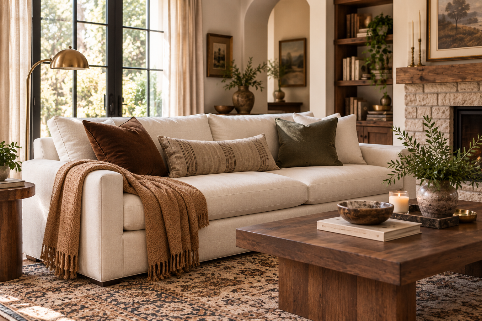
If you’re wondering what colors go with a cream sofa, the good news is that cream works with almost any decorating style. But its versatility creates a different problem: what do you put around it without ending up with a room that feels flat, overly beige or disconnected?
The easiest colors to pair with a cream sofa are chocolate brown, camel, taupe, mushroom, muted olive, soft black, rust, burgundy and muted blue. Warm wood tones such as oak and walnut can also provide the contrast a pale sofa needs.
The best choice depends less on finding one perfect accent color and more on building a small palette around the flooring, wood tones and other finishes already in the room.
Quick Cream Sofa Color Guide
If you already know what your room is missing, start here:
| If your room needs… | Try this palette |
| More warmth and depth | Cream + chocolate brown + camel |
| A soft tonal look | Cream + taupe + mushroom |
| Earthy color | Cream + olive + warm brown |
| Cleaner contrast | Cream + soft black + warm wood |
| Richness without much color | Cream + walnut + oatmeal |
| A warmer earthy accent | Cream + muted rust + brown |
| A cooler accent | Cream + muted blue + taupe |
| A deeper, collected look | Cream + burgundy + warm wood |
| A mostly neutral room | Cream + oatmeal + brown |
If your room currently feels too pale, chocolate brown is the easiest place to start. If you want to stay very tonal, choose taupe or mushroom but make sure the room still contains darker wood, texture or pattern.
Start With the Colors Already in Your Room
Before choosing a new accent color, look at the parts of the room that are expensive or inconvenient to change:
- flooring
- wall color
- area rug
- large wood furniture
- fireplace or stone
- the sofa itself
Treat those as your starting palette.
For example, a cream sofa on light oak flooring already creates a warm, low-contrast base. Adding several more pale tan pieces may make everything blend together. A chocolate pillow, olive accent or medium-to-dark wood table would create more definition.
Put the same sofa in a room with dark walnut flooring and you have the opposite situation. The floor is already providing contrast, so camel, oatmeal and mushroom may be enough to soften the room.
Choose smaller accents to connect the finishes you already have instead of designing an entirely new palette around a pillow or vase.
That one decision will make the rest of the room much easier to coordinate.
Check Whether Your Cream Sofa Reads Warm, Neutral or Greige
Not every cream sofa looks the same.
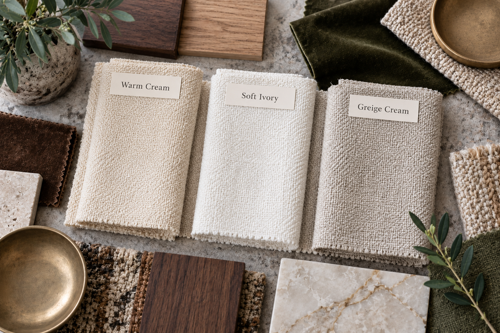
Some upholstery has a buttery or yellow warmth. Some reads closer to ivory. Other cream fabrics lean toward greige.
You do not need to overanalyze the undertone. Look at the sofa during daylight and compare it with the flooring, walls and a true white object nearby. The goal is simply to notice whether it reads distinctly warm, fairly neutral or slightly gray-beige.
Color appearance can also change as the light changes. Benjamin Moore notes that both natural and artificial lighting can influence whether undertones appear warmer or cooler, particularly with subtle neutral colors.
Use that as a guide rather than a rigid rule. A warm cream sofa does not mean every item around it has to be warm. It simply helps explain why certain combinations may look more harmonious or more contrasting in your particular room.
Use This Simple Cream Sofa Palette Formula
Instead of asking which single color matches cream, build the room around five parts:
Cream sofa + grounding color + supporting neutral + wood + texture
The grounding color gives the room definition. Think chocolate brown, olive, soft black, burgundy or another noticeably deeper tone.
The supporting neutral bridges that darker color back to the sofa. Camel, taupe, mushroom and oatmeal are especially useful here.
The wood tone brings natural color and visual weight. It can be light oak, medium warm wood or darker walnut depending on the contrast already in the room.
Then add texture through materials such as linen, wool, velvet, woven fibers, wood or aged metal.
You do not need every accent to match. A better rule is to repeat your grounding color two or three times in different ways, then let the supporting neutrals and materials connect the room.

1. Cream + Chocolate Brown + Camel
If your cream sofa living room feels too pale, chocolate brown is one of the strongest places to begin.
It gives cream noticeable depth while staying within a warm neutral palette. Camel softens the jump between the light sofa and darker brown.
A simple version of the palette could include:
- chocolate brown pillows
- a camel throw
- medium or dark warm wood
- oatmeal or warm ivory curtains
- aged brass or bronze lighting
The brown does not need to dominate. Two pillows, a coffee table and a small amount of brown in artwork may be enough to ground the room.
Choose this palette if: you want a warm neutral living room to feel richer without adding obvious color.
2. Cream + Camel + Warm Wood
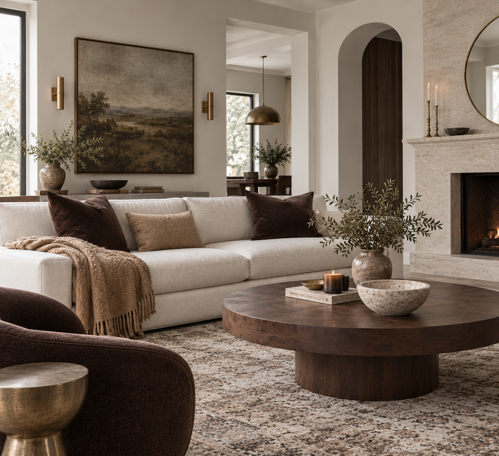
For less contrast, pair cream with camel and warm natural wood.
This works especially well when you like an almost-all-neutral room but want it to feel warmer than cream and beige alone.
Camel is most effective when the material looks distinctly different from the sofa. Try a woven textile, wool throw, leather accent or deeper camel pillow rather than another smooth pale fabric.
Then add enough wood to give the room structure.
Warm oak or a medium brown coffee table can prevent the cream-and-camel combination from becoming washed out.
Choose this palette if: you want warmth and softness rather than a dramatic contrast.
3. Cream + Taupe + Mushroom
Taupe and mushroom are useful when you want a quiet tonal room without repeating the exact same beige everywhere.
The challenge is contrast of value and texture.
A mushroom rug that is several shades deeper than the sofa will create more depth than three accessories that are almost identical to the upholstery.
Try:
- cream upholstery
- deeper mushroom or taupe
- oatmeal linen
- medium wood
- aged brass or dark bronze
- wool, woven or nubby textures
If the sofa, rug, curtains and walls are all equally pale and equally smooth, the room can still feel flat even when each individual piece is attractive.
Choose this palette if: you want a sophisticated room with very little visible color.
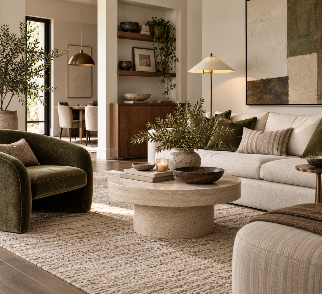
4. Cream + Olive + Warm Brown
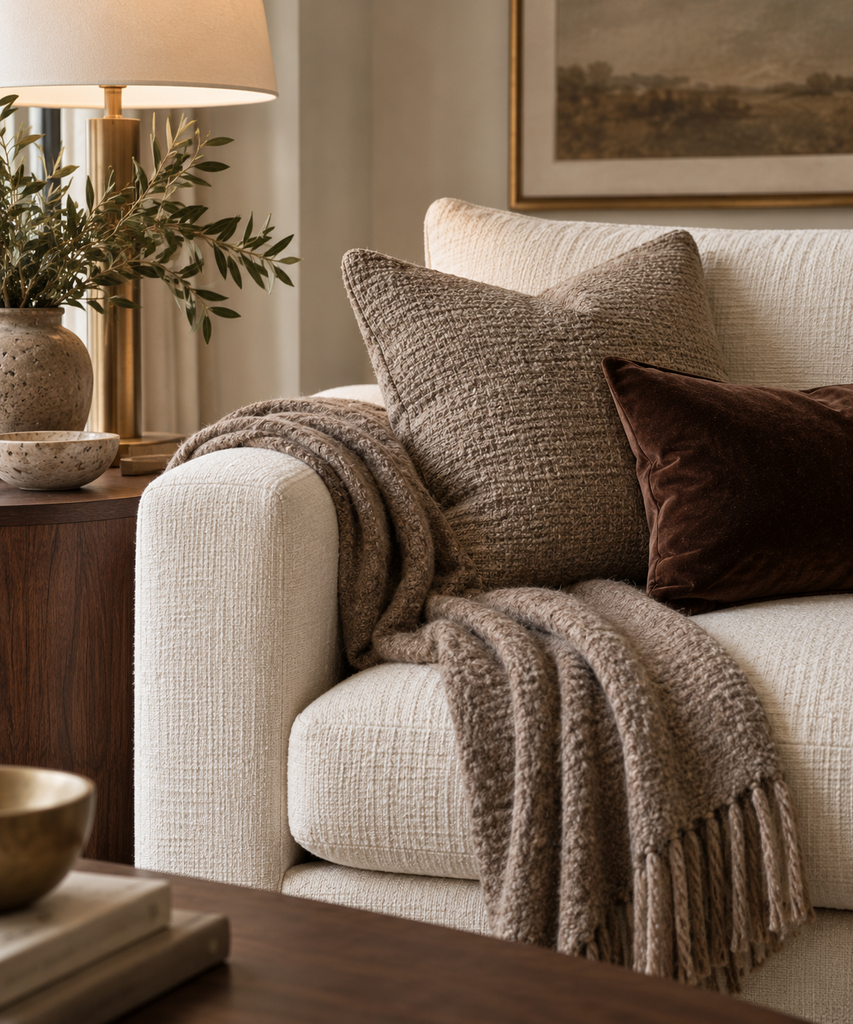
Muted olive is a useful middle ground between neutral and color.
It adds enough contrast to make a cream sofa more interesting while still working naturally with brown, wood and warm neutrals.
Keep the green controlled. Good places for olive include:
- one or two pillows
- artwork
- a small upholstered accent
- ceramics
- branches or greenery
Then repeat brown elsewhere through wood furniture, textiles or artwork so the olive feels connected to the rest of the palette.
If you use a deeper olive, keep large surfaces such as the rug and curtains quieter.
Choose this palette if: you want an earthy room with some color that still reads primarily neutral.
Shop the Cream Sofa Formula
Add depth to a cream sofa with richer wood, subtle pattern and a warm metal finish.
Warm Walnut Side Table
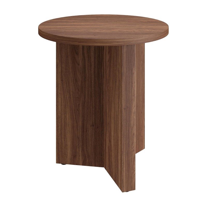
Adds rich wood tone and
contrast beside a cream sofa.
Brown Striped Pillows
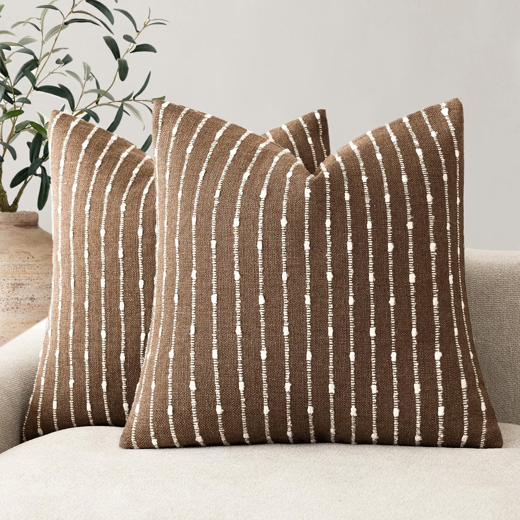
Adds pattern and texture while bringing contrast to a cream sofa.
Modern Brass Table Lamp
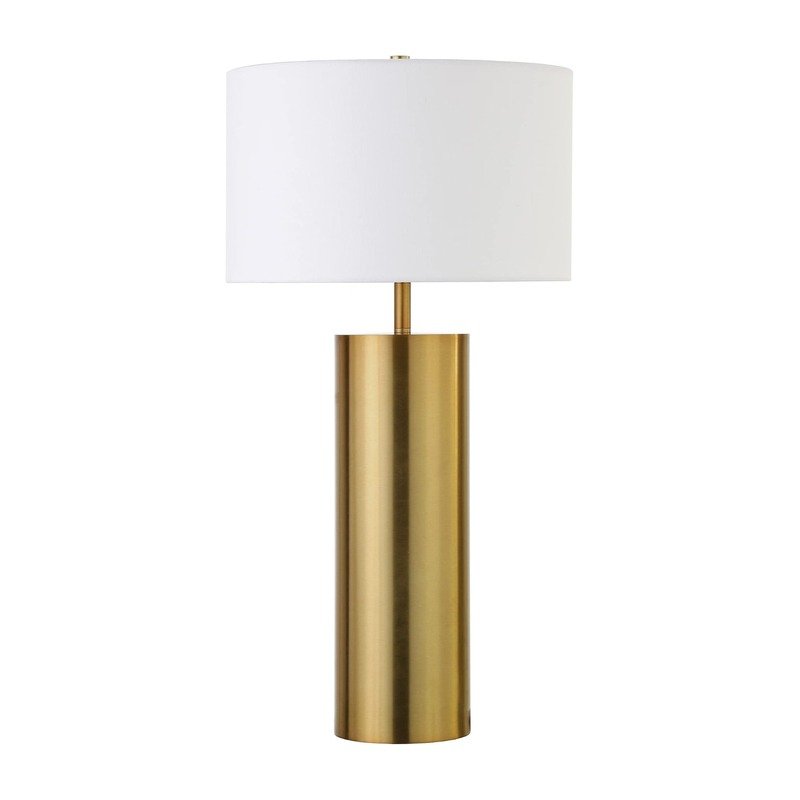
Adds warm metal and contrast to a cream sofa palette.
Black works with a cream sofa when it is used as definition rather than domination.
Small black details can sharpen a room full of soft neutrals:
- floor or table lamps
- picture frames
- slim furniture legs
- hardware
- a small side table
- a restrained black pattern
Warm wood is important here because it keeps cream and black from becoming too stark.
A cream sofa with a walnut table and black lamp will usually feel warmer and more layered than a room filled with black metal furniture.
Choose this palette if: your neutral living room needs a cleaner, more modern edge.

6. Cream + Walnut + Oatmeal
You do not have to add a strong accent color at all.
Walnut can become the grounding element.
This works particularly well in a pale room where the sofa, walls and textiles are already light.
A substantial walnut coffee table, console or pair of darker side tables can add enough visual weight to anchor the seating area.
Keep the textiles softer:
- oatmeal
- flax
- ivory
- camel
- subtle brown pattern
You also do not need every wood piece to match perfectly. Related warm wood tones often look more natural than a furniture set where every finish is identical.
Choose this palette if: you want richness without making the room feel more colorful.
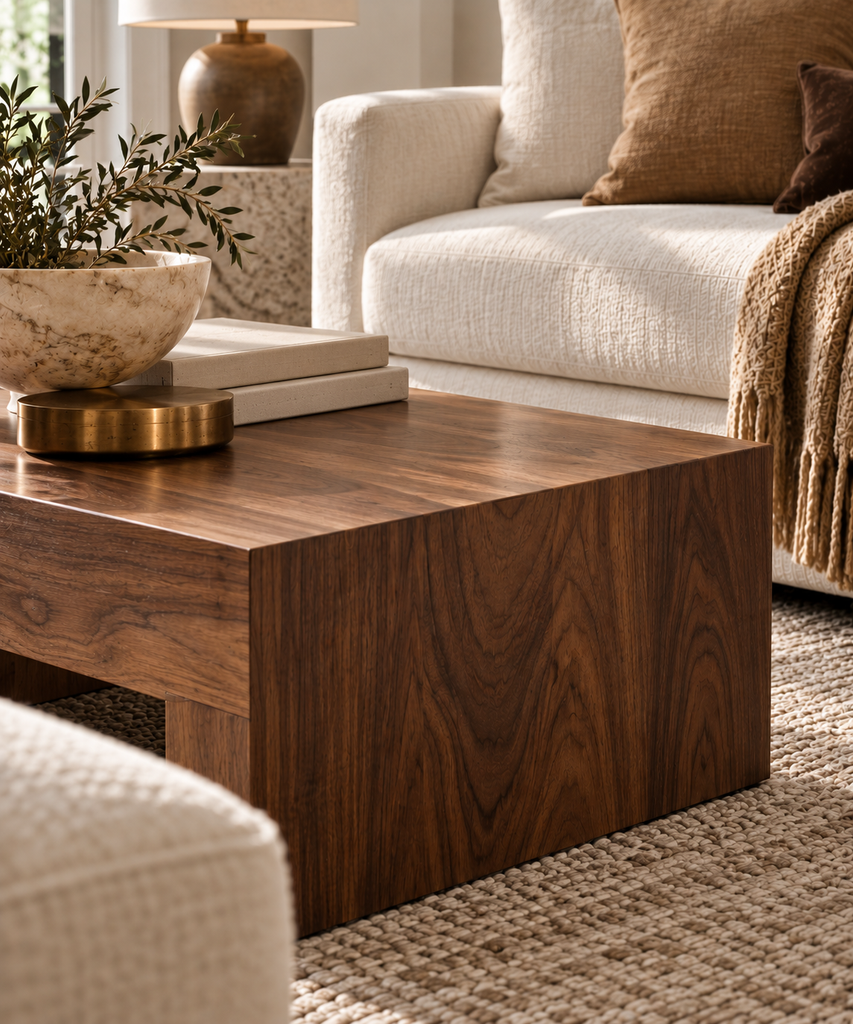
Shop the Cream + Walnut Look
Build the room with richer wood, subtle pattern and natural stone for contrast that still feels warm and cohesive.
Walnut Coffee Table
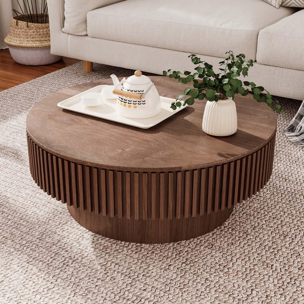
Adds a darker wood anchor and architectural contrast to a cream room.
Brown & Ivory Area Rug

Adds soft pattern and definition without making the room feel heavy.
Travertine Pedestal Bowl
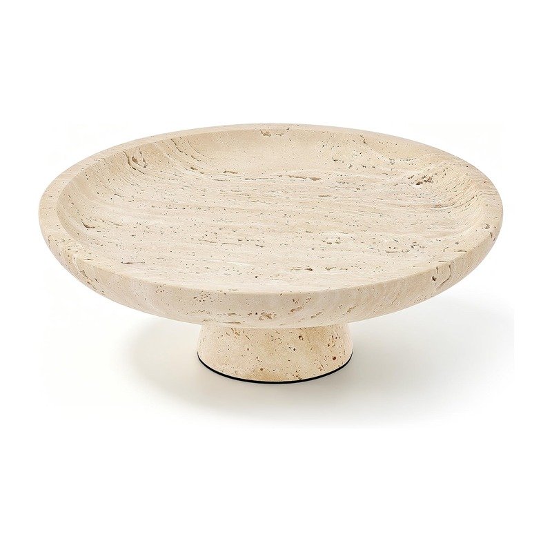
Adds natural stone texture and a sculptural finishing layer.
7. Cream + Muted Rust + Brown
Muted rust brings warmth to cream without requiring a strongly colorful room.
The key is choosing an earthy, softened rust rather than bright orange.
Use it sparingly with brown and camel:
- one rust pillow
- chocolate or warm brown textile
- camel throw
- warm wood
- oatmeal rug
Because rust is only the accent, the room can still feel neutral overall.
This combination also transitions easily into fall. A change in textiles or a branch arrangement can make the room feel seasonal without replacing the larger furniture.
Choose this palette if: you want an earthy warm-neutral room with a little more character.
8. Cream + Muted Blue + Taupe
Cream does not have to be paired only with warm colors.
A dusty blue, slate blue or muted gray-blue can provide a cooler contrast while taupe keeps the palette grounded.
For a predominantly neutral room, introduce blue in smaller amounts:
- pillows
- artwork
- pottery
- a patterned rug containing cream, taupe and muted blue
Warm wood helps balance the cooler accent.
Choose this palette if: you want some color but prefer a calm, understated look rather than a distinctly blue living room.
9. Cream + Burgundy + Warm Wood
A small amount of burgundy can make cream feel deeper and more collected.
Look for muted wine or burgundy rather than bright red, then keep the rest of the palette quiet.
Try burgundy in:
- one velvet or textured pillow
- artwork
- a subtle rug pattern
- a small decorative object
Pair it with cream, camel and warm wood rather than adding several more strong colors.
Choose this palette if: you want a richer accent than brown but still prefer deep, earthy color.
10. Layered Cream + Oatmeal + Brown
Yes, a cream sofa can work in an almost entirely neutral room.
The secret is making sure the neutrals are not all doing the same job.
A stronger tonal palette might combine:
- cream sofa
- oatmeal linen
- slightly deeper taupe or beige
- medium brown wood
- one chocolate accent
- woven or nubby texture
- aged metal
The problem is not using too much cream. It is using the same depth of cream in the same texture on every surface.
A cream sofa, wool rug, linen curtains and wood table can all stay neutral while still creating clear layers.
If this is the look you want, my guide to 15 Warm Neutral Living Room Ideas for a Cozy, Layered Home goes deeper into contrast, texture and warmth.
Choose this palette if: you want the room to remain predominantly cream and neutral.
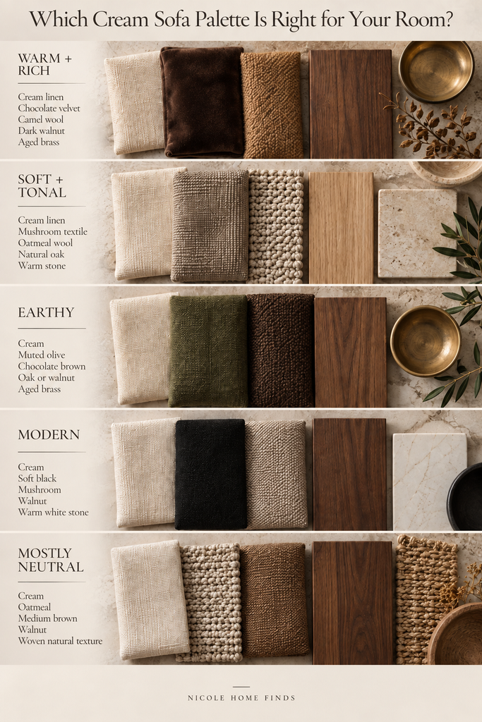
Which Cream Sofa Palette Is Right for Your Room?
Use the room you already have to narrow the choice.
| If you want… | Ground the room with… | Support it with… | Wood direction | Contrast |
| Warm + rich | Chocolate brown | Camel | Walnut or medium-dark wood | Medium-high |
| Soft + tonal | Taupe | Mushroom/oatmeal | Light or medium oak | Low |
| Earthy | Olive | Warm brown | Oak or walnut | Medium |
| Modern | Soft black | Oatmeal/taupe | Warm medium or dark wood | High |
| Natural + neutral | Walnut | Oatmeal | Mixed warm woods | Medium |
| Warm + earthy | Muted rust | Brown/camel | Walnut or oak | Medium |
| Cooler + calm | Muted blue | Taupe | Medium warm wood | Medium |
| Rich + collected | Burgundy | Camel | Medium or dark warm wood | Medium-high |
| Mostly neutral | Brown | Oatmeal | Medium wood | Low-medium |
If you are still unsure, use this shortcut:
Room looks too pale: start with chocolate brown.
Room feels cold: introduce camel or warm wood.
Room feels boring but you don’t want much color: try walnut or olive.
Room already has dark floors or furniture: keep the supporting colors lighter.
Still Pulling the Room Together?
Choosing the palette is only one part of creating a neutral living room that feels finished. Get the Neutral Living Room Checklist for a simple guide to the major pieces, layers and finishing details to work through next.
What If You Have Oak Floors, Dark Wood or Beige Carpet?
Large fixed finishes should influence the palette more than small décor.
What Colors Go With a Cream Sofa and Oak Floors?
Light and medium oak already add warmth.
Instead of surrounding them with more pale tan, try chocolate brown, olive, mushroom or a deeper wood accent.
If you prefer a light room, let pattern or texture provide some of the contrast through the rug, coffee table or lighting.
What Colors Go With a Cream Sofa and Dark Wood?
Cream and dark wood already provide strong contrast.
You usually do not need another equally dark element. Soften the combination with:
- camel
- oatmeal
- mushroom
- muted olive
- warm ivory
This is a good situation for lighter rugs and textiles because the wood is already anchoring the room.
What Colors Go With a Cream Sofa and Beige Carpet?
Cream upholstery and beige carpet can visually merge if there is no darker anchor.
Before adding more beige, introduce contrast through:
- walnut or medium brown wood
- chocolate textiles
- olive
- muted rust
- a patterned area rug
Even over wall-to-wall carpet, an area rug can help define the seating area and introduce a clearer palette.
What Color Rug, Pillows and Curtains Go With a Cream Sofa?
Once you choose your overall palette, these pieces should repeat and support it, not introduce three unrelated ideas.
What Color Rug Goes With a Cream Sofa?
A cream sofa can work with a warm neutral rug, deeper taupe, subtle pattern or a rug containing one of the accent colors already used in the room.
The main goal is enough distinction between the sofa, rug and floor.
If your sofa and flooring are both very light, a slightly deeper neutral or patterned rug will usually give the seating area more definition.
For specific options, see my guide to Best Neutral Area Rugs.
What Color Pillows Go With a Cream Sofa?
Use pillows to repeat your grounding color.
For example:
Chocolate palette: chocolate + camel + textured cream
Olive palette: olive + warm brown + oatmeal
Tonal palette: mushroom + taupe + ivory texture
Two or three related tones are usually easier to coordinate than a collection of unrelated accent colors.
What Color Curtains Go With a Cream Sofa?
Curtains do not need to match a cream sofa.
Warm ivory, oatmeal, flax, taupe and mushroom can all work.
If your walls and sofa are already very similar in color, curtains that are slightly deeper or visibly textured can define the windows without turning them into the room’s focal point.
How to Keep a Cream Living Room From Looking Flat
If a cream living room feels unfinished, adding more décor is not always the answer.
Look for what is missing.
Add one darker anchor
Try one substantial contrast element:
- walnut coffee table
- chocolate pillows
- darker rug pattern
- black lamp
- olive accent
One anchor is often more effective than several small dark accessories scattered around the room.
Change the materials, not just the colors
Cream boucle, linen, wool, velvet and woven fibers can look very different even when their colors are close.
Texture is especially important in tonal rooms.
Repeat one accent instead of adding another
An olive pillow used once may look accidental.
Repeat a related olive tone in artwork or another small element and it starts to look intentional.
The same principle works with brown, burgundy, rust or black.
Use wood to create natural contrast
A wood table adds color, grain and visual weight without introducing another fabric color.
This is one of the easiest ways to keep a neutral living room warm.
Layer the lighting
A room can look flatter at night if the only light comes from one ceiling fixture.
A table lamp and floor lamp create smaller pools of light that reveal texture and give the room more depth.
For more ways to solve this specific problem, see 15 Warm Neutral Living Room Ideas for a Cozy, Layered Home.
Cream Sofa FAQs
Does brown go with a cream sofa?
Yes. Chocolate brown, walnut, espresso and medium warm browns all provide useful contrast against cream. If the brown feels too heavy on its own, add camel or oatmeal between the dark and light tones.
Does olive green go with cream?
Yes. Muted olive is especially useful when you want earthy color without making the room feel overtly colorful. Pair it with warm wood or brown to keep the palette grounded.
Can black work with a cream couch?
Yes. Black is most effective in smaller elements such as lighting, frames, legs, hardware or a small table. Warm wood can soften the contrast between black and cream.
What wood tone works with a cream sofa?
Cream can work with light oak, medium warm wood and dark walnut. Choose the wood based on the amount of contrast the room needs rather than trying to match every wood finish exactly.
Should a rug be lighter or darker than a cream sofa?
Either can work. What matters is having enough difference in color, pattern or texture for the sofa and rug to remain visually distinct.
If your sofa, rug and floor are all similarly pale, introduce a deeper element elsewhere.
Should curtains match a cream sofa?
No. Curtains can be cream, but they can also be oatmeal, flax, mushroom or taupe. Matching the sofa exactly is less important than choosing a color and texture that fits the full room palette.
The Simplest Place to Start
If your cream sofa is surrounded by pale neutrals and something still feels off, don’t replace the room.
Choose one grounding element first.
That might be a chocolate pillow, walnut coffee table, muted olive accent or rug with a little more depth.
Repeat that direction once or twice, then let the rest of the room stay quiet.
A cream sofa works best as the calm foundation of the space—not as a color every other piece needs to copy.
If you’re still building the room, continue with Best Neutral Area Rugs or browse the Living Room Shop for pieces that can help establish the palette before adding more decorative accessories.