

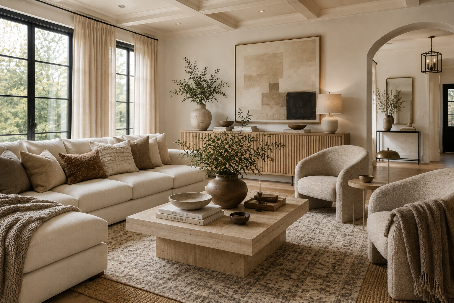
15 Warm Neutral Living Room Ideas for a Cozy, Layered Home
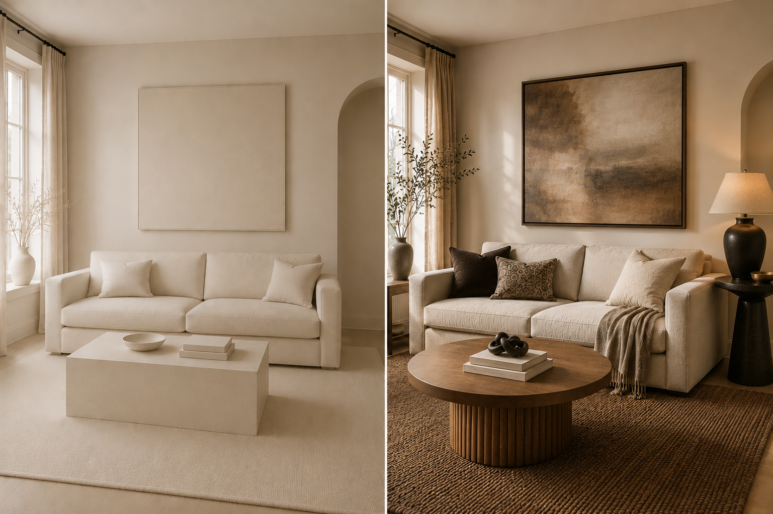
A neutral living room can have beautiful furniture and perfectly coordinated colors and still feel a little cold, flat or unfinished. Usually, the problem isn’t that the room needs more décor. It needs more depth.
The best warm neutral living room ideas rely on contrast within a quiet palette: cream against taupe, smooth surfaces beside woven ones, pale upholstery grounded by warm wood, soft textiles balanced by stone or ceramic, and lighting that creates pockets of warmth instead of illuminating everything the same way.
If you want a neutral living room to feel cozy, elevated and expensive looking, focus less on matching and more on layering color, texture, material, scale and light. Here are 15 ways to do it thoughtfully.
What Makes a Neutral Living Room Feel Warm Instead of Flat?
A warm neutral room needs variation.
A useful formula is:
warm undertones + several neutral depths + mixed textures + natural materials + controlled contrast + layered light
If the walls, sofa, rug, curtains and pillows are all nearly the same beige, even attractive pieces can disappear into one another. Give those surfaces slightly different tones and textures, and the room begins to feel layered.
Before buying anything new, look at the room in those six categories. Often, the missing element becomes obvious. A pale room may need one deeper tone. A beige sofa may need a rug with texture rather than more beige pillows. An otherwise finished space may simply need softer lighting at eye level.
That is a much better starting point than adding décor at random.
Build the Right Warm Neutral Color Palette
1. Start With Warm White or Cream
Warm white and cream create a softer foundation for beige, taupe, brown and natural wood than a very crisp white usually does.
That does not mean every neutral needs a yellow undertone. It means the colors should make sense beside one another.
Before choosing a new rug, curtain or large upholstered piece, compare it directly with the surfaces that will surround it. Look at the combination during the day and again under your normal evening lighting. A cream that appears soft in daylight can look noticeably more yellow beside a cooler sofa after dark.
A simple warm-neutral palette might include:
- warm white or ivory
- oatmeal
- sand
- beige
- mushroom
- taupe
- camel
- medium brown
You do not need all eight. A tighter palette of three or four main neutrals plus one deeper anchor usually feels more deliberate than a room containing every shade of beige.
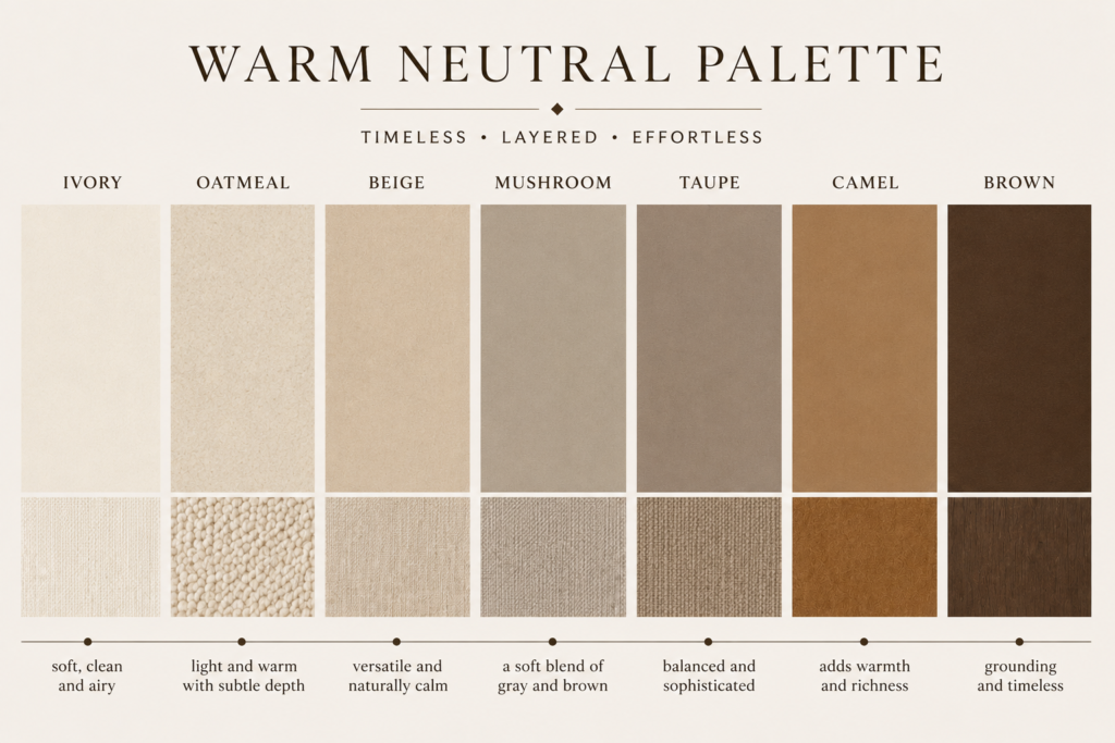
2. Layer Beige, Taupe and Mushroom Instead of Matching Everything
Matching is not the same as coordinating.
If you already have a beige sofa, resist the urge to repeat that exact beige in the rug, curtains and every pillow. Give the eye subtle changes in value instead.
For example:
- warm cream walls
- an oatmeal sofa
- a taupe-and-ivory rug
- medium brown wood
- mushroom pillows
- one camel accent
Nothing competes for attention, but each layer remains visible.
If you are unsure whether two neutrals work together, place them side by side rather than judging them separately. They should either be close enough to feel intentional or different enough to create clear contrast. The awkward zone is often two almost-matching shades whose undertones do not agree.
3. Ground the Palette With a Deeper Neutral
Light neutrals need a little visual weight.
That can come from walnut, chocolate brown, deep taupe, charcoal, muted olive, aged brass or a small amount of black.
You do not need a dramatic accent wall or a collection of dark accessories. One darker coffee table, lamp, frame or patterned textile may be enough to define the lighter pieces around it.
Think of darker tones as punctuation. They should give the room structure, not become a second decorating scheme.
Can Cream, Beige and Taupe Work Together?
Yes. The combination works particularly well when the shades vary in depth but share a compatible warmth.
A simple hierarchy helps:
lightest: walls or large background surfaces
middle: sofa, rug or curtains
deepest: wood, occasional furniture and smaller accents
That prevents an all-neutral palette from becoming visually indistinct.
Layer Texture So a Neutral Living Room Doesn’t Look Boring
“Add texture” is common decorating advice. The useful question is which textures, and where?
4. Give Adjacent Surfaces Different Textures
Start with pieces that sit next to one another.
A smooth sofa benefits from a visibly woven or nubby pillow. A sleek coffee table feels more balanced on a soft wool-look rug. Plain walls become more interesting beside linen curtains.
Useful soft textures include:
- linen and linen-look fabrics
- wool and wool-blend rugs
- bouclé used selectively
- woven cotton
- soft knits
- lightly slubbed fabrics
You do not need a different texture on every object. Two adjacent pieces simply should not all disappear into the same surface treatment.
Shop the Look: Layered Neutral Textures
These textured pillow covers make it easy to bring cream, taupe and warm brown into the same space while adding dimension to a neutral sofa.
Soft Textured Knit Throw
Layer a soft oatmeal throw over the sofa to introduce another texture while keeping the palette warm and neutral.
5. Balance Fabric With Natural Material
A room made entirely of upholstered and woven surfaces can begin to feel overly soft. Balance those materials with something more structured.
Warm neutral rooms work especially well with combinations such as:
linen + wool + wood + ceramic
or:
cotton + stone + woven fiber + glass
The contrast between soft and hard materials is what creates interest.
A ceramic lamp beside a linen sofa, a warm wood table over a textured rug, or a stone bowl on a timber surface can do more for a neutral room than another decorative cushion.

6. Use a Simple Texture Check
Stand at the entrance to the room and mentally sort what you see into five categories:
soft — sofa, chair, throw
woven — rug, curtain, basket
nubby — textured pillow or upholstery
smooth — glass, ceramic, metal
natural — wood or stone
You do not need something from every category, but if everything falls into only one or two, the room may need material contrast rather than more color.
Pillows and throws are an easy place to introduce another layer of texture without changing your neutral color palette.
Use Warm Wood and Contrast to Give Neutrals Depth
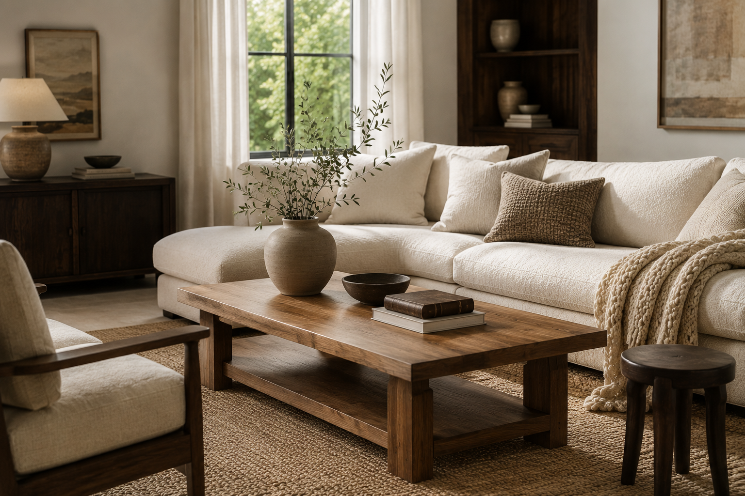
7. Bring in Warm Wood Tones
Wood is particularly useful in a cream-and-beige room because it provides both color and texture without introducing a completely different palette.
Light oak keeps the room airy. Medium brown adds definition. Walnut brings a richer contrast.
Do not worry about making every wood piece identical. A coffee table, picture frame and side table can vary slightly as long as the overall mix feels related.
A useful approach is to establish one dominant wood tone and repeat a related version of it elsewhere. If the coffee table is medium brown, for example, echo that warmth in a frame, bowl or lamp base.
That repetition is what makes mixed pieces look collected rather than random.
Warm Wood Coffee Table
A warm wood coffee table adds natural contrast and depth to a cream or beige living room while keeping the overall palette soft and neutral.
8. Add Contrast Where the Room Needs Definition
Contrast is most useful at edges and focal points.
If a pale sofa blends into a pale wall, deeper pillows can help define it. If an ivory rug disappears against light flooring, subtle taupe or brown pattern can create separation. If a console looks lost against the wall, a darker lamp or mirror frame can give that area more weight.
Good contrast options for a warm-neutral palette include:
- chocolate or espresso brown
- darker walnut
- muted charcoal
- small black details
- deep olive
- antique or aged brass
Use one or two deliberately rather than scattering every option through the room.
Choose Textiles That Make the Room Feel Softer and More Finished
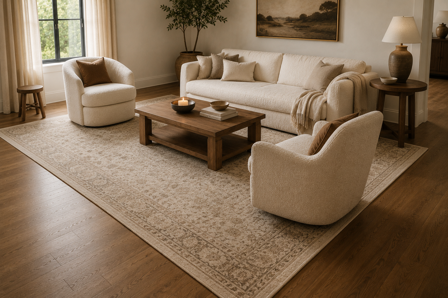
9. Anchor the Seating Area With the Right Rug
A rug affects far more than the floor. It determines whether the furniture reads as one seating arrangement or as individual pieces floating around the room.
For a warm neutral living room, evaluate four things.
Scale: The rug should feel connected to the main seating pieces rather than sitting like a small mat between them. Where the layout allows, having at least the front portion of the main seating visually engage with the rug usually creates a more unified arrangement.
Undertone: Compare the rug with the sofa and flooring, not with an online swatch in isolation.
Variation: A rug with two or three related neutrals, subtle pattern or visible weave often adds more depth than a completely flat solid cream.
Contrast: A very pale sofa can benefit from a rug that is a little deeper. A darker sofa may look better against a lighter ground.
If the room feels disconnected, fix the rug before buying more accessories.
Warm Neutral Area Rug
A warm neutral rug with subtle tonal variation adds softness and depth to the room while giving the seating area a cohesive, grounded look.
10. Use Curtains to Add Height and Softness
Curtains occupy a large amount of visual space, which means their placement matters as much as their color.
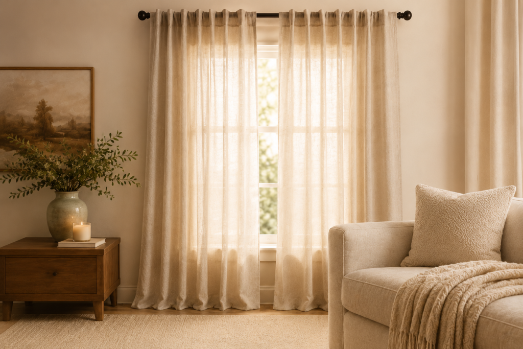
If the architecture allows, position the rod above the window frame and extend it beyond the sides so the panels can frame the opening rather than covering most of the glass. Full-length panels create a cleaner vertical line than curtains that stop awkwardly above the floor.
For a warm-neutral room, two approaches are especially easy to use:
Quiet and tonal: ivory or cream panels close to the wall color.
Soft contrast: oatmeal or pale beige panels a shade or two deeper than the wall.
Texture can do the rest. Linen and linen-look fabrics provide movement without needing a bold print.
Always compare the fabric to the actual wall, sofa and rug before deciding. “Beige” on a product label tells you very little about whether its undertone suits your room.
Full-Length Linen-Look Curtains
Full-length curtains in a soft cream or oatmeal tone add softness and height while giving a neutral living room a more finished, elevated look.
11. Style the Sofa With Variation, Not Matching Sets
A neutral sofa does not need five different colors to look layered.
Use differences in size, texture and shape first.
For example:
- one larger solid pillow
- one visibly textured pillow
- one smaller patterned or deeper-toned pillow
- one throw with a different weave
A cream sofa could use oatmeal, mushroom and warm brown without leaving the neutral palette.
Avoid building the arrangement from an entire matching set. Repetition is useful, but identical size, color and texture across every pillow can make the styling feel flat.
Layered Neutral Pillow Pairing
Pair a linen-look square pillow with a smaller textured lumbar to create variation in size, shape and texture while keeping the palette warm and neutral.
Layer Lighting Instead of Relying on the Ceiling
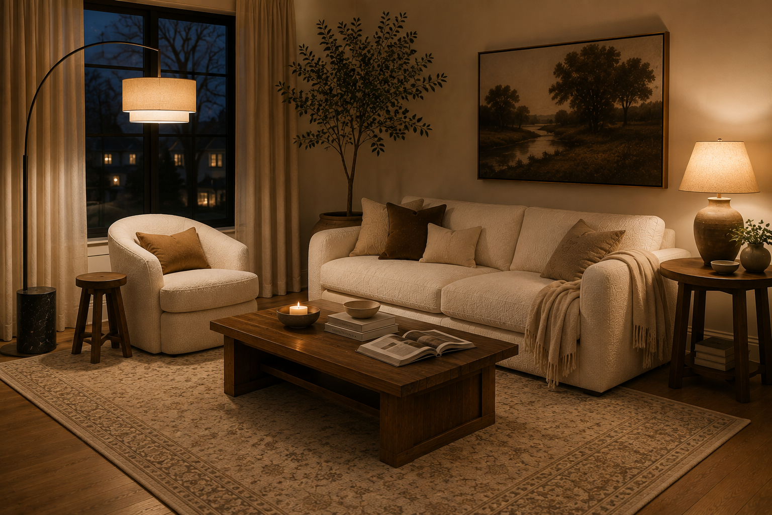
12. Create Several Pools of Light
Living Room lighting affects how every color and texture in the room is perceived after sunset.
Instead of relying entirely on one overhead fixture, create light at more than one height:
- overhead light for general illumination
- floor lamp beside a sofa or chair
- table lamp on a console or side table
The lamps do not need to match. They should feel related in scale, material or finish.
This matters especially in neutral rooms because grazing light across linen, wood and textured fabrics makes those materials more visible. A room lit uniformly from above tends to lose some of that dimension.
Warm Arc Floor Lamp
An arc floor lamp brings warm light closer to the seating area while adding height and visual interest to a neutral living room.
Keep the Light Color Consistent
If one lamp looks amber while another looks noticeably blue-white, the room can feel visually disjointed.
Choose bulbs with a similar warm appearance for fixtures that are used together. If a lamp has an exposed shade or bulb, also consider how the light itself looks in the room, not just how attractive the fixture is when switched off.
Style With Fewer, Better-Proportioned Pieces
13. Replace Clusters of Tiny Décor With Visual Anchors
A room does not look more finished simply because every table has something on it.
Several very small objects can create visual noise, particularly in a restrained neutral palette. Give a few pieces more presence instead.
Try:
- one substantial piece of art over several undersized frames
- a larger vase instead of multiple small vessels
- a generous mirror where a wall needs weight
- a stack of books with one sculptural object rather than a crowded tray
This is not about making the room minimal. It is about making the hierarchy clear.
Browse our curated living room finds for pieces that can add warmth, texture and visual interest to your space.
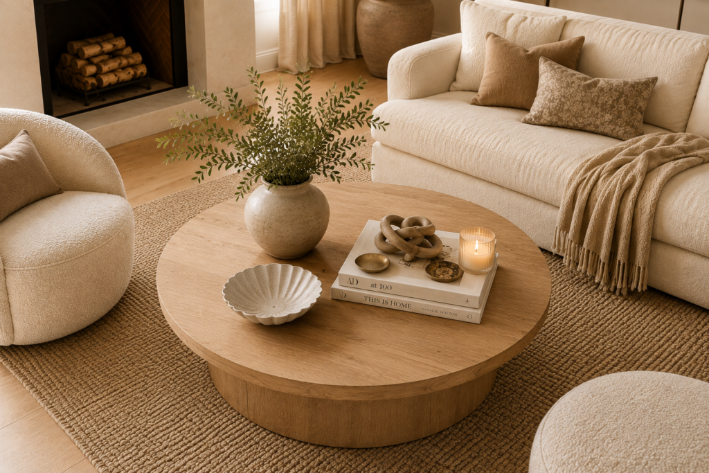
14. Use Organic Shapes to Break Up Straight Lines
Look around most living rooms and you will see rectangles everywhere: sofa, rug, television, windows, console and artwork.
One or two rounded or irregular shapes can soften that geometry without changing the room’s color scheme.
Useful options include:
- round or softly curved coffee tables
- arched or organically shaped mirrors
- rounded lamp bases
- sculptural bowls
- curved accent chairs
- irregular ceramic vessels
This is also where an organic modern living room influence can work beautifully within a warm-neutral scheme. Use the natural materials and softer silhouettes; there is no need to rebuild the entire room around a trend or style label.
Repeat Materials to Make the Room Feel Intentional
A polished room usually has visual echoes.
If you use dark wood once, repeat a related brown elsewhere. If a brass lamp introduces a warm metal, one smaller brass detail across the room can connect it. If the rug contains taupe, bring that tone up into a pillow or piece of art.
The repetition does not need to be exact. In fact, exact matching can make a room feel more like a showroom than a home.
Make the Room Look More Expensive by Fixing Scale First
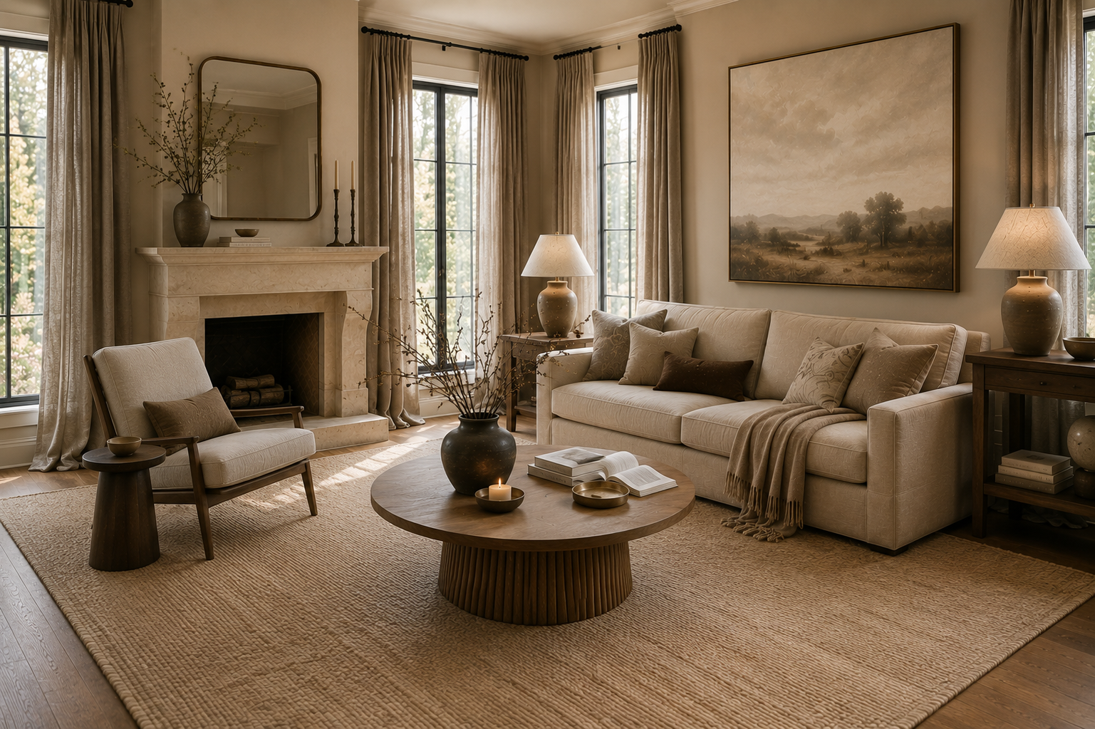
15. Check Proportion Before You Buy More Décor
One of the most effective answers to how to make a neutral living room look expensive is also one of the least glamorous: get the scale right.
Stand back and evaluate the largest relationships in the room.
Rug: Does it connect the seating or float between it?
Curtains: Do they frame the architecture generously, or look skimpy beside the window?
Coffee table: Does it have enough visual presence for the sofa?
Artwork: Is it substantial enough for the wall or furniture below it?
Lighting: Are the lamps tall and substantial enough to hold their own beside the furniture?
Accessories: Are dozens of small objects compensating for one missing focal point?
Correcting one large proportion problem often changes the room more than adding five new decorative pieces.
That is especially useful if you are decorating on a realistic budget. Before replacing your sofa or buying an entire set of new furniture, make sure the rug, curtains, lighting and major visual anchors are doing their jobs.
7 Mistakes That Make a Neutral Living Room Feel Cold or Boring
1. Using the Same Beige Everywhere
A single beige repeated across every major surface removes depth.
Instead: vary the value. Pair cream with oatmeal, taupe, mushroom or brown.
2. Ignoring Undertones
Two neutrals can both be labeled beige and still look wrong beside one another.
Instead: compare fabrics and finishes together in the actual room and in the light in which you will use them.
3. Choosing a Rug That Is Too Small for the Seating Group
An undersized rug can make the furniture appear disconnected.
Instead: think of the rug as the visual foundation of the seating arrangement, not simply a decoration for the empty floor in the middle.
4. Relying on One Overhead Light
One source illuminates the room uniformly and can leave corners feeling either too dark or the entire room too bright.
Instead: add lighting at different heights.
5. Buying Entire Matching Décor Sets
Matching colors can still look flat when the size, shape and texture never change.
Instead: coordinate rather than duplicate.
6. Filling Every Surface
Neutral does not automatically mean calm if tables, consoles and shelves are crowded.
Instead: decide which surfaces need a focal point and which can be left quieter.
7. Forgetting Contrast
Cream, beige and ivory need enough depth around them to remain visible.
Instead: use deeper wood, brown, charcoal, olive or metal in small, intentional amounts.
Warm Neutral Living Room FAQs
What colors work best in a warm neutral living room?
Warm white, ivory, cream, beige, mushroom, taupe, camel and brown can all work well together. Choose a limited group with compatible undertones, then vary the depth so the furniture and surfaces do not blend into one large block of beige.
Can you mix cream, beige and taupe?
Yes. A simple way to combine them is to let cream form the light background, use beige through larger furnishings or textiles, and bring taupe into the rug, pillows or smaller accents for depth.
How do you make a neutral living room feel cozy?
Layer several neutral tones, mix soft and structured materials, bring in warm wood, use a rug that visually anchors the seating and add lamps at different heights. Cozy neutral rooms rely more on texture, light and proportion than on adding extra accessories.
How do you make a beige living room less boring?
Create visible differences between surfaces. Add texture, introduce a deeper neutral, vary the wood and textile finishes, and make sure the rug, curtains and artwork are substantial enough for the room.
What accent colors work with warm neutrals?
Brown, muted olive, charcoal and small amounts of black can provide useful contrast without overwhelming a warm-neutral palette. Warm metal finishes can add another layer without introducing a strong new color.
What wood tones work with beige and cream?
Light oak, medium warm brown and deeper walnut can all work with beige and cream. Choose based on the amount of contrast your particular room needs, and repeat related wood tones in more than one place so the choice feels intentional.
Does everything in a neutral living room have to match?
No. A neutral room usually looks more dimensional when the pieces coordinate rather than match exactly. Repeat a few colors and materials, but vary the shades, textures and shapes.
The Most Expensive-Looking Neutral Rooms Aren’t the Most Matched
A beautiful warm-neutral room is built through relationships between pieces.
Cream looks richer beside wood. Beige looks more intentional next to taupe. A simple sofa feels more finished when the rug is properly scaled, the curtains frame the window generously and the lighting creates depth after dark.
Before buying more décor, look for the missing layer: tone, texture, material, contrast, scale or light.
Fixing that one thing is often what takes a neutral living room from pleasant to polished.
Ready to bring the look together? Browse our curated living room finds for warm, elevated pieces to complete your space.